自然と健やかさ
Nature & Health
東洋の伝統文化
Traditional Culture of the East
社会課題
Social Issues
芸術と文化
Art & Culture

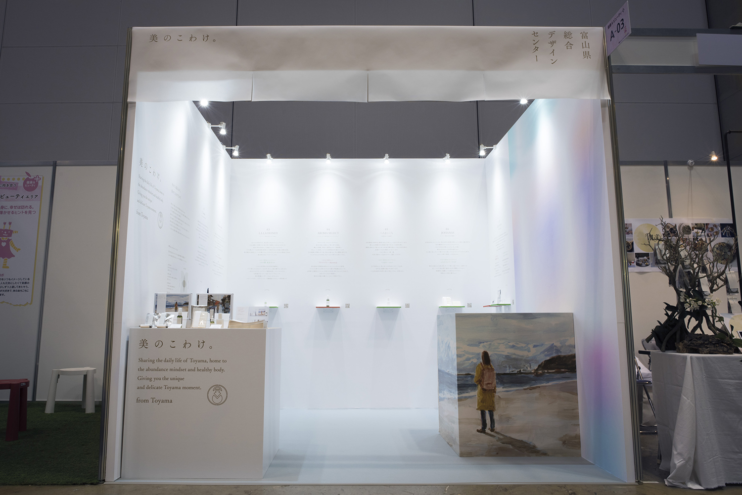
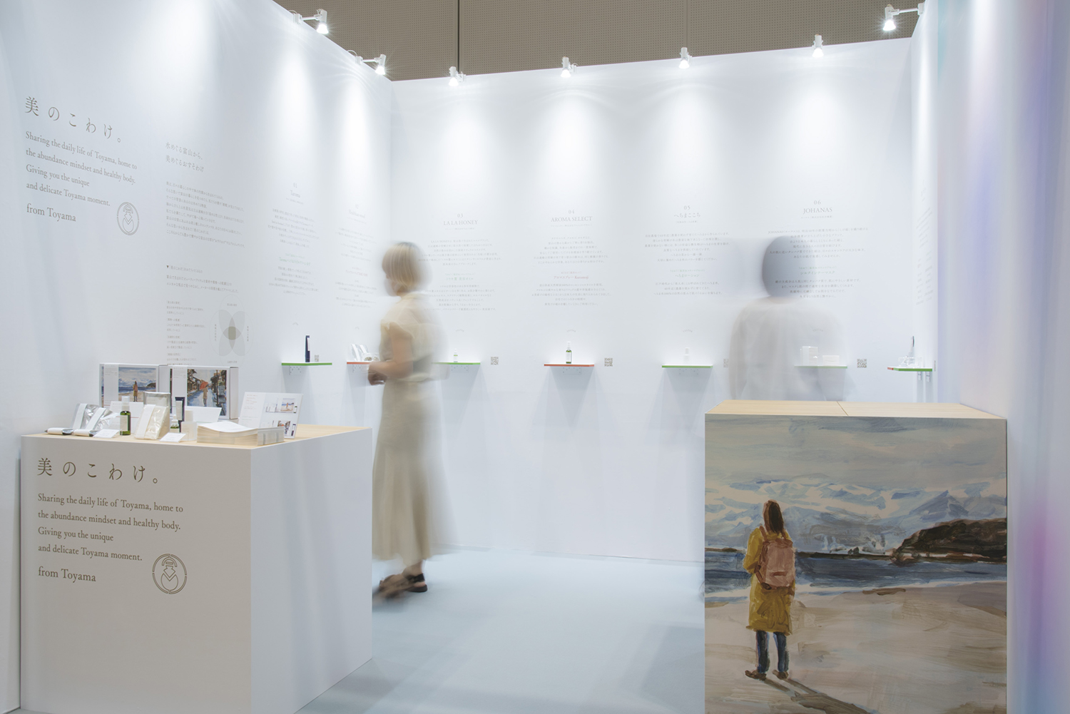
美のこわけ
3000m級の立山連峰から水深1000mの富山湾まで、高低差4000mの富山の地形。そこでは、地球規模の水の循環が起こっています。雨は山々の緑を育て、森はその水を蓄えて、大地から湧き出す清流は、多様な生物たちはもちろん、人々の恵みとなります。
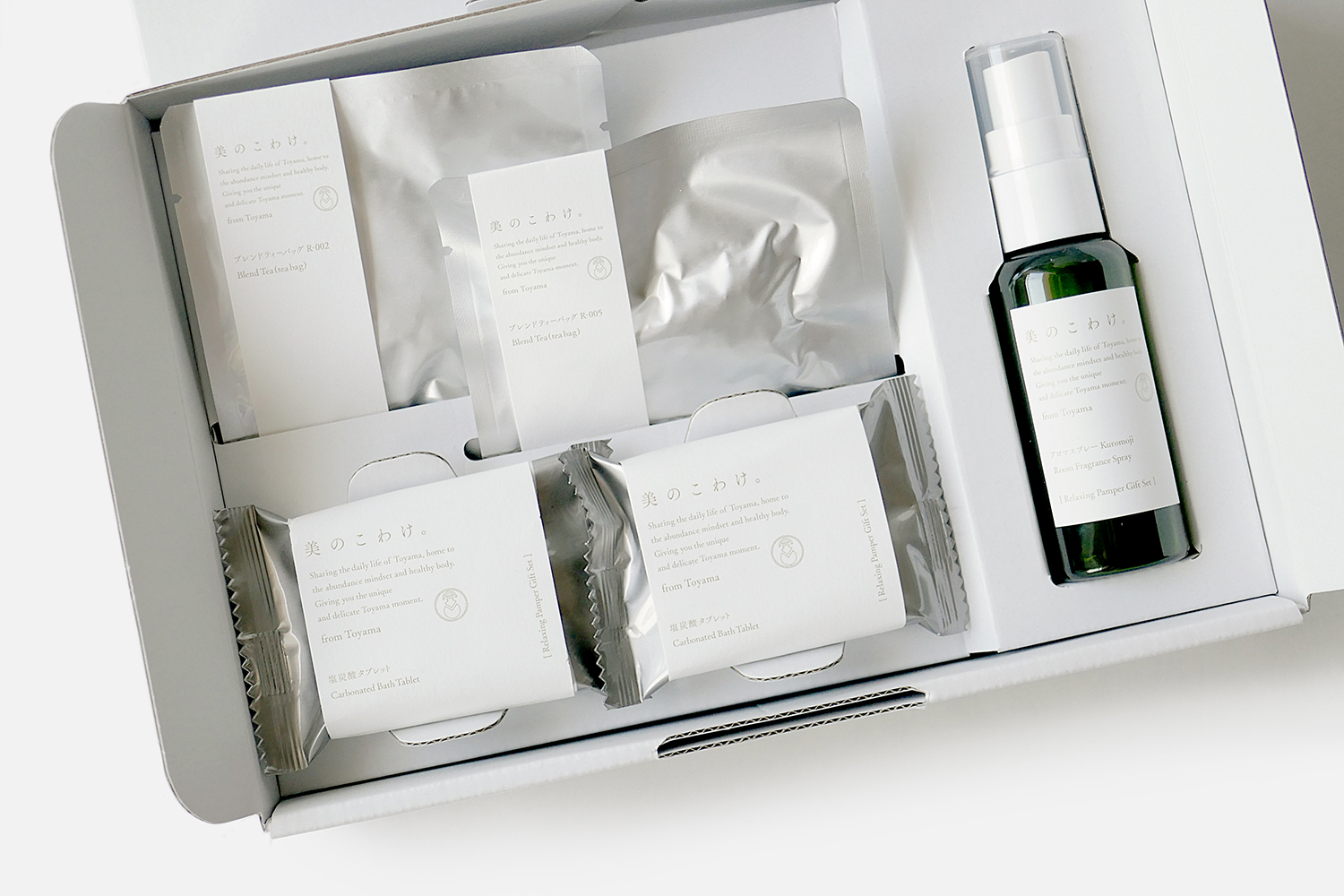
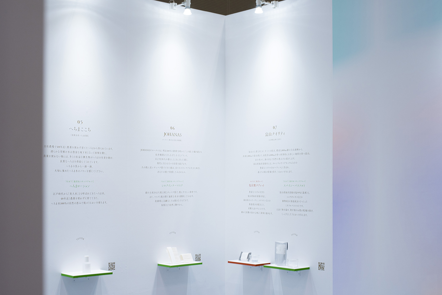
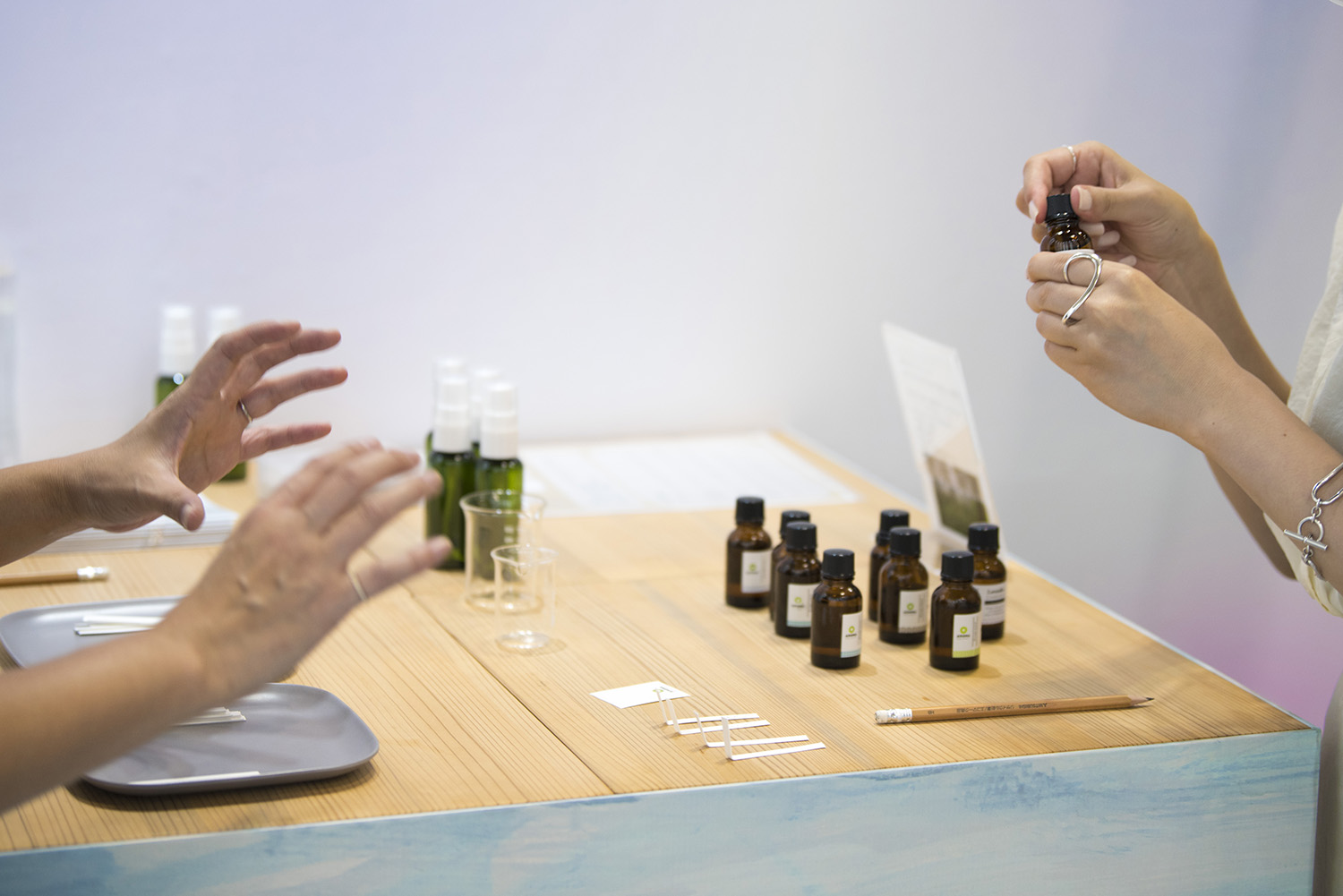
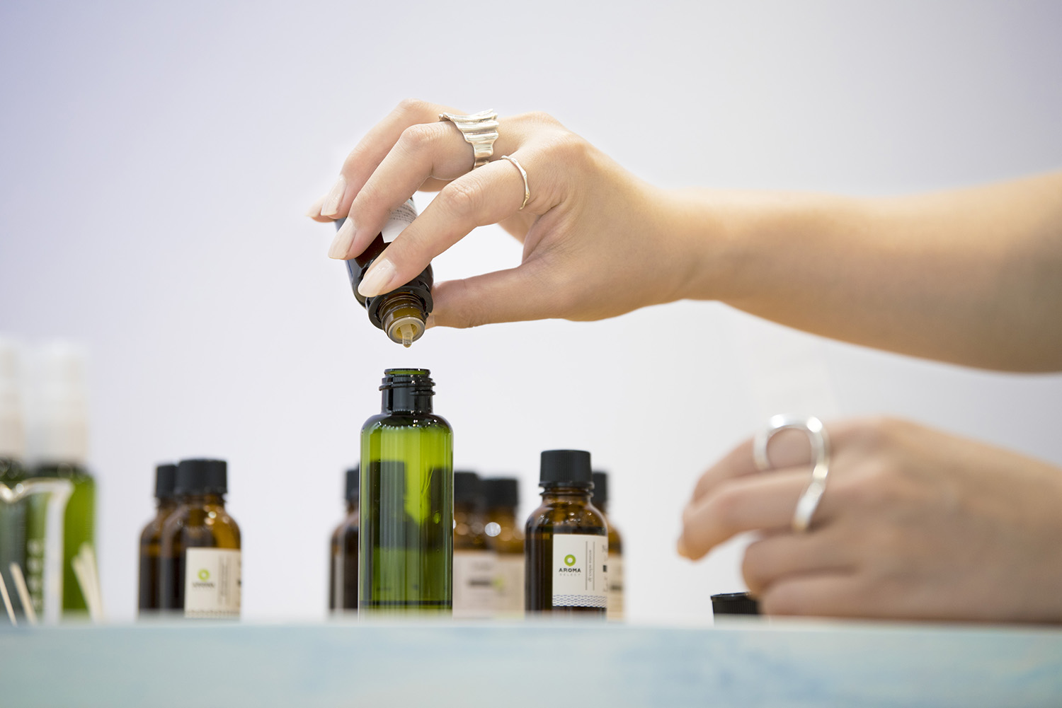
そんな特殊な地形を持った場所・富山の豊かな自然素材を使い、富山で製造されたものだけにこだわった「美のこわけ」。メーカーの垣根を越えた「美」にまつわるアイテムのつめあわせが登場しました。富山の文化「こわけ」(おすそわけ)から着想を得ています。
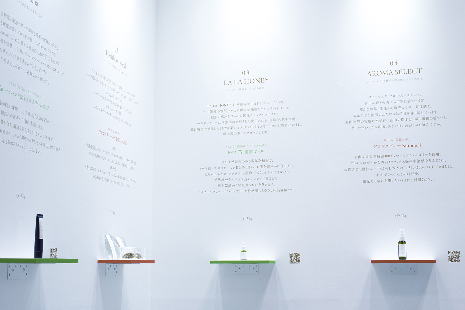
山を管理する森林組合と協力して、間伐した樹木を用いて精油を作り、その廃材でバイオマス発電を行ったり、40年間一切農薬を使用せずに植物を育て、江戸時代から愛されてきたへちま水を作ったり、土壌から見直して有機栽培をした桑の葉で育てたお蚕さまが生み出す絹で、上質な布を織ったり、心が揺さぶられるほどのこだわりをつめこんだ質の高いものだけを集めています。そして、その全てに、富山の水の恩恵があります。
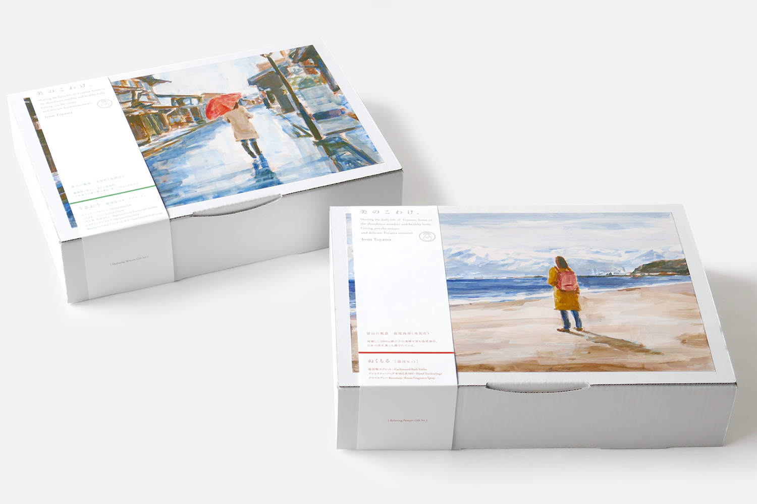
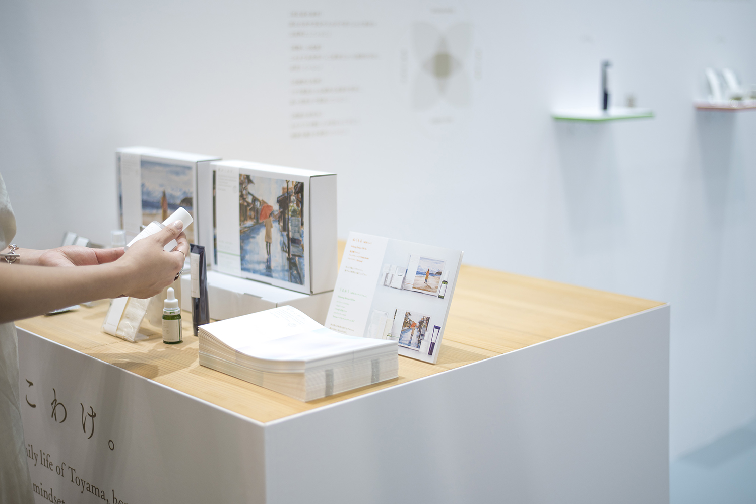
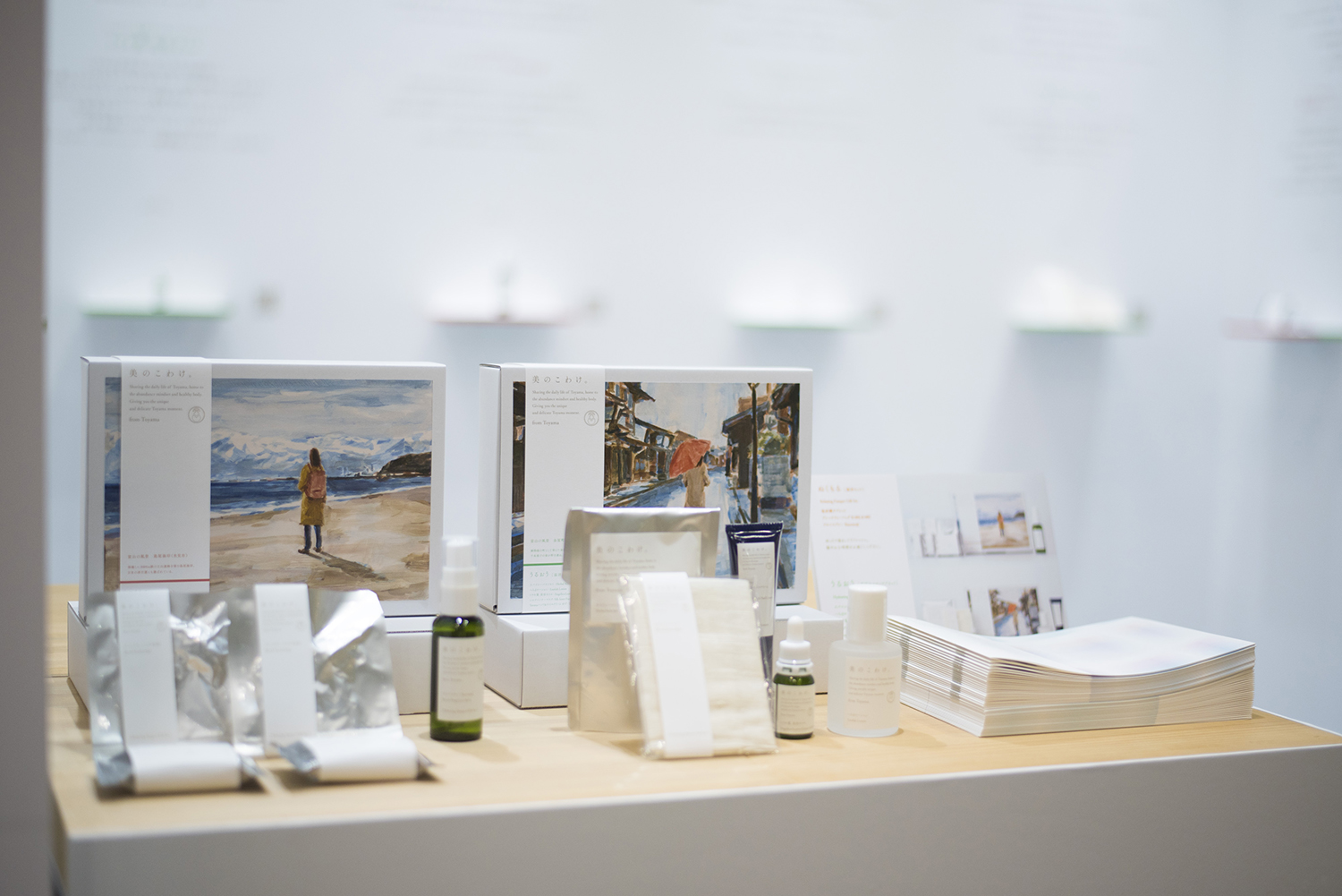
アソートボックスのパッケージは、豊かな自然、水の恵み、歴史ある街並みといった富山らしさを見せながらも、スキンケアアイテムとして日常に馴染むような透明感や優しさを表現するために、agoera氏にイラストを依頼しました。肌の保湿にも良いと言われる富山の湿度の高い空気感を、深く美しいブルーグレーがかった色彩で描いていただきました。旅するように美に触れて、それが富山に訪れるきっかけとなるよう、その願いを象徴するように、絵の中でも旅人がひとり、富山の風景にたたずんでいます。
アソートボックスのパッケージにおいて、印刷に使われるインクはNON-VOCインキを指定しています。大気汚染を招く危険性の高い有害物質・VOC(揮発性有機化合物)を発生させる石油系溶剤をほぼ使用していません。印刷は納品先に近い富山県に位置する山田写真製版所に依頼することで、配送時に発生するCO2を極力抑えました。
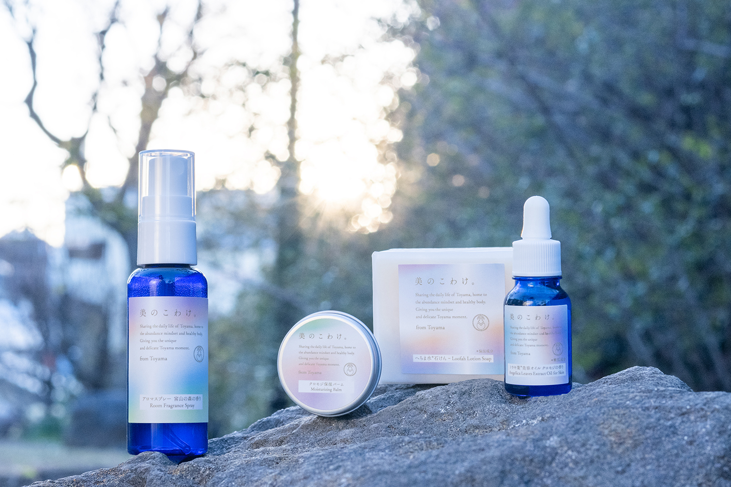
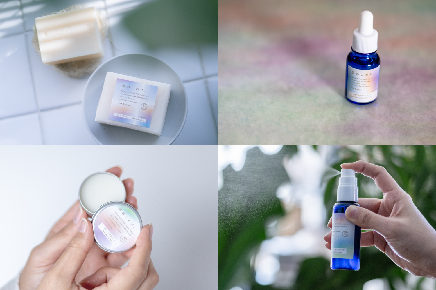
つめあわせに続いて登場した、美のこわけでしか購入できないオリジナル商品のパッケージには、有機的なグラデーションをあしらい、水に日光が当たってできる光の波をイメージしています。
PM : 株式会社PCO
AD, D : 清水彩香
I : agoera
PH : 松本雅直
箱制作 : 株式会社竹尾, 株式会社泰清紙器製作所
CL : 富山県総合デザインセンター
Bi no Kowake
From the 3,000-meter peaks of the Tateyama Mountain Range to the 1,000-meter depths of Toyama Bay, the 4,000-meter elevation difference shapes Toyama’s distinctive terrain. This region experiences a global-scale water cycle: rain nourishes the lush mountains, the forests store the water, and the pure streams flowing from the earth sustain not only diverse ecosystems but also the people who benefit from them.
Bi no Kowake is a collection of beauty products that honors this unique landscape by using only natural materials from Toyama and limiting production to items made within the region. Inspired by Toyama’s tradition of "kowake" (sharing), this assortment transcends individual brands, bringing together items that celebrate beauty in various forms.
In collaboration with local forestry cooperatives, trees are selectively thinned to produce essential oils, with the leftover materials repurposed for biomass power. Other products include loofah water, cultivated without pesticides for 40 years and cherished since the Edo period, and high-quality fabric woven from silk produced by silkworms fed on organic mulberry leaves grown in revitalized soil. Each item embodies a deep commitment to quality and dedication to craftsmanship, all connected by the blessings of Toyama’s abundant water.
For the assortment box packaging, illustrator agoera was commissioned to create visuals that capture Toyama’s essence―its rich natural beauty, the blessings of water, and its historic townscapes―while adding a sense of transparency and warmth, making it a harmonious addition to everyday skincare. The high humidity of Toyama, believed to benefit skin hydration, is represented in a serene blue-gray palette that conveys the area’s moist air. To evoke the idea of discovering beauty on a journey and to encourage visits to Toyama, the illustration features a lone traveler standing within a Toyama landscape.
All ink used for printing is specifically NON-VOC ink. Petroleum-based solvents that generate VOCs (volatile organic compounds) were almost never used, as these harmful substances carry a high risk of causing air pollution. Printing is managed by YAMADA PHOTO PROCESS CO.,LTD, located nearby in Toyama Prefecture, helping to minimize CO2 emissions from transportation.
Following the assortment box, Bi no Kowake has introduced exclusive items that feature packaging with an organic gradient, inspired by the rippling waves of light created when sunlight touches water.
PM : Professional Congress Organizer Co., Ltd.
AD, D : Ayaka Shimizu
I : agoera
PH : Masanao Matsumoto
Box Production : TAKEO CO., LTD., Taiseishiki Seisakusho
CL : Toyama prefecture general design center